Type Design
TYPE DESIGN
Because the world can always use more type.
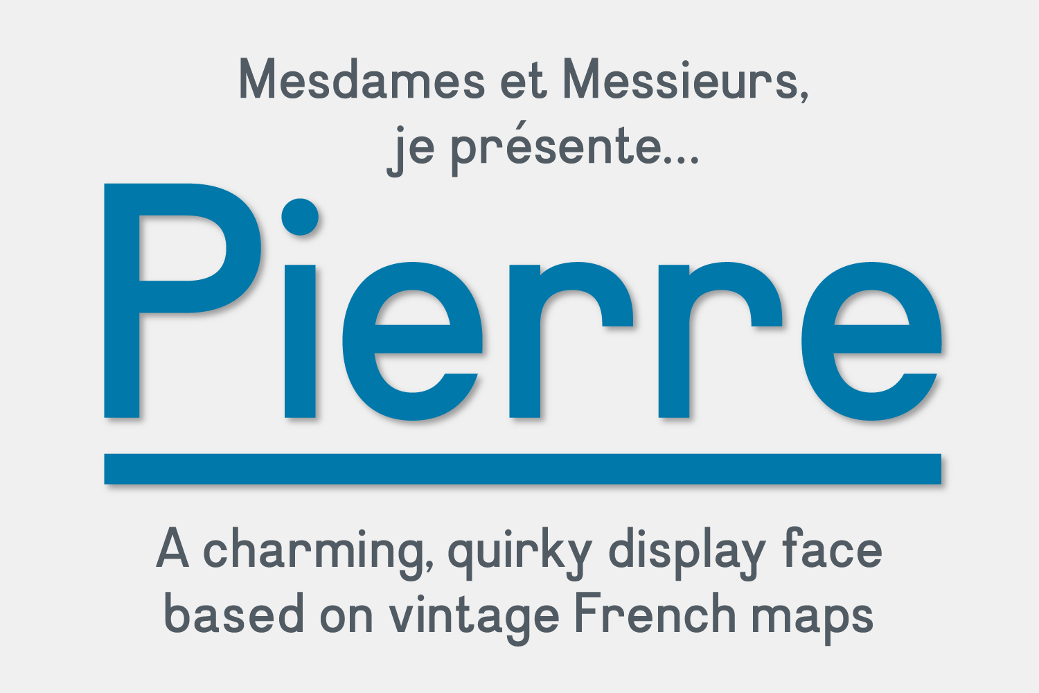
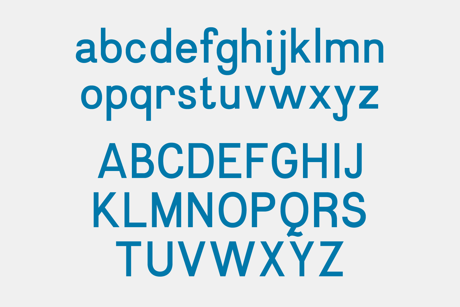
Pierre: 7x7, a new city magazine, called for a display type as unique as San Francisco itself.
Enter a collection of vintage French maps. The handlettered type had just the right mix of elegance and oddness. After digitizing and tweaking to unify the forms, Pierre was born.


Q: How do you improve on Wim Crouwel’s work?
A: You don’t. (Sorry; trick question.)
But remixing his 1960s-era typeface, Gridnik, gave it a new spin in this special section for The Industry Standard.


Pachinko Display Italic: This feature story for Wired was about pachinko, the wildly popular Japanese arcade game. The display text begged to be set vertically.
The solution was found in a type book, appropriately published by Japanese firm Pineapple’s Studio Graphic. The strong geometry of this face made it a versatile starting point.
